Introduction
In this article, I explain my personal views on the pros and cons of using bitmap fonts and vector fonts.
Terminology
- Bitmap fonts: They consist of a matrix of dots or pixels representing the image of each glyph in each face and size. The extension of bitmap fonts usually are
*.pcfand*.bdf. - Vector fonts: Glyphs are stored as a collection of scalable lines. The extension of vector fonts usually are:
*.otf(OpenType font),*.ttf(TrueType font),*ttc(TrueType Collection) or*.otc(OpenType Collection).
Bitmap font
Pros
When I’m programming on a laptop, the screen space is very limited, so I prefer using bitmap fonts because I can significantly decrease the font size, still see the content clearly and fit as much lines as possible in the screen. Because many lines fit on the screen, I don’t have to scroll very frequently.
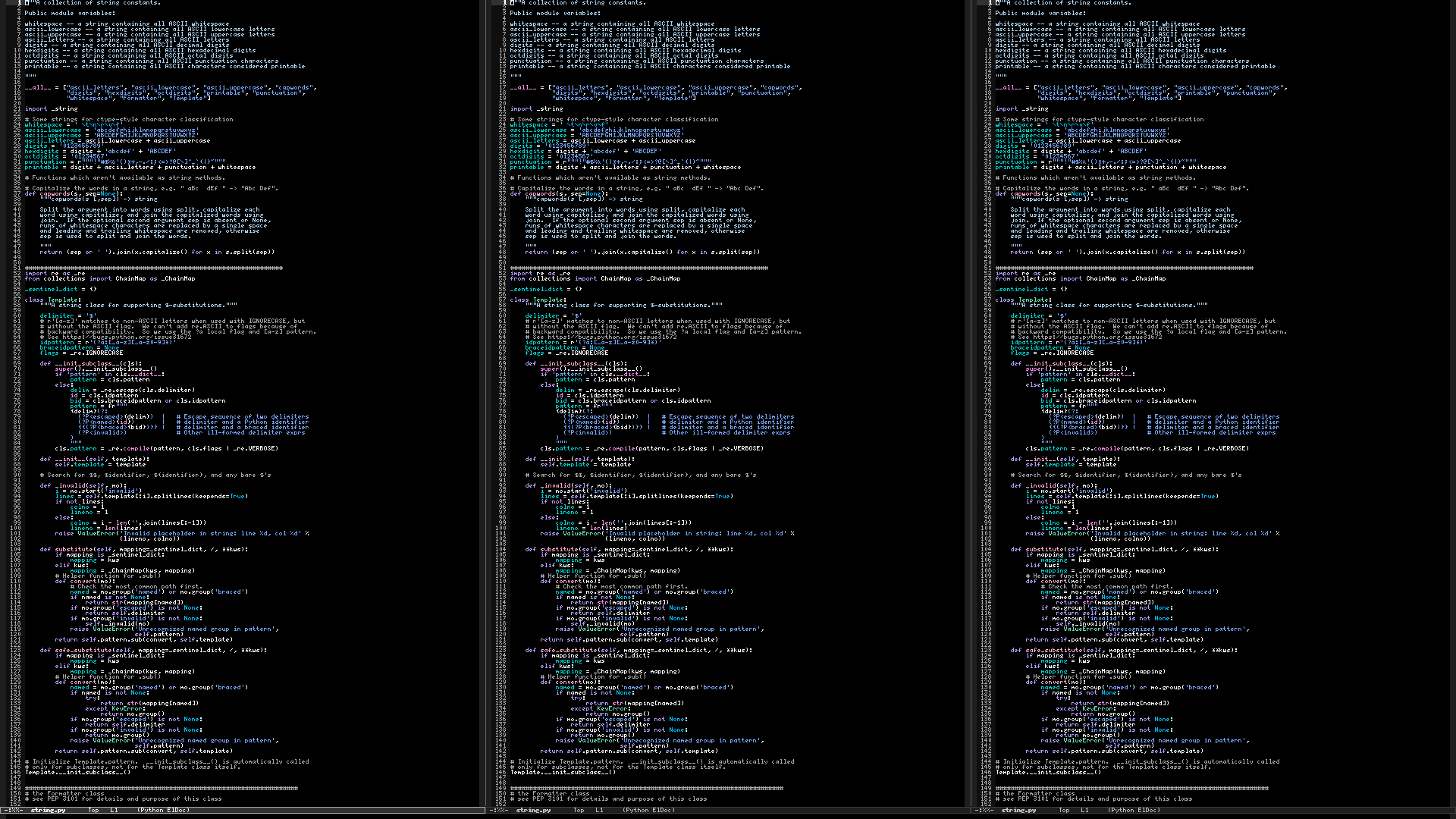
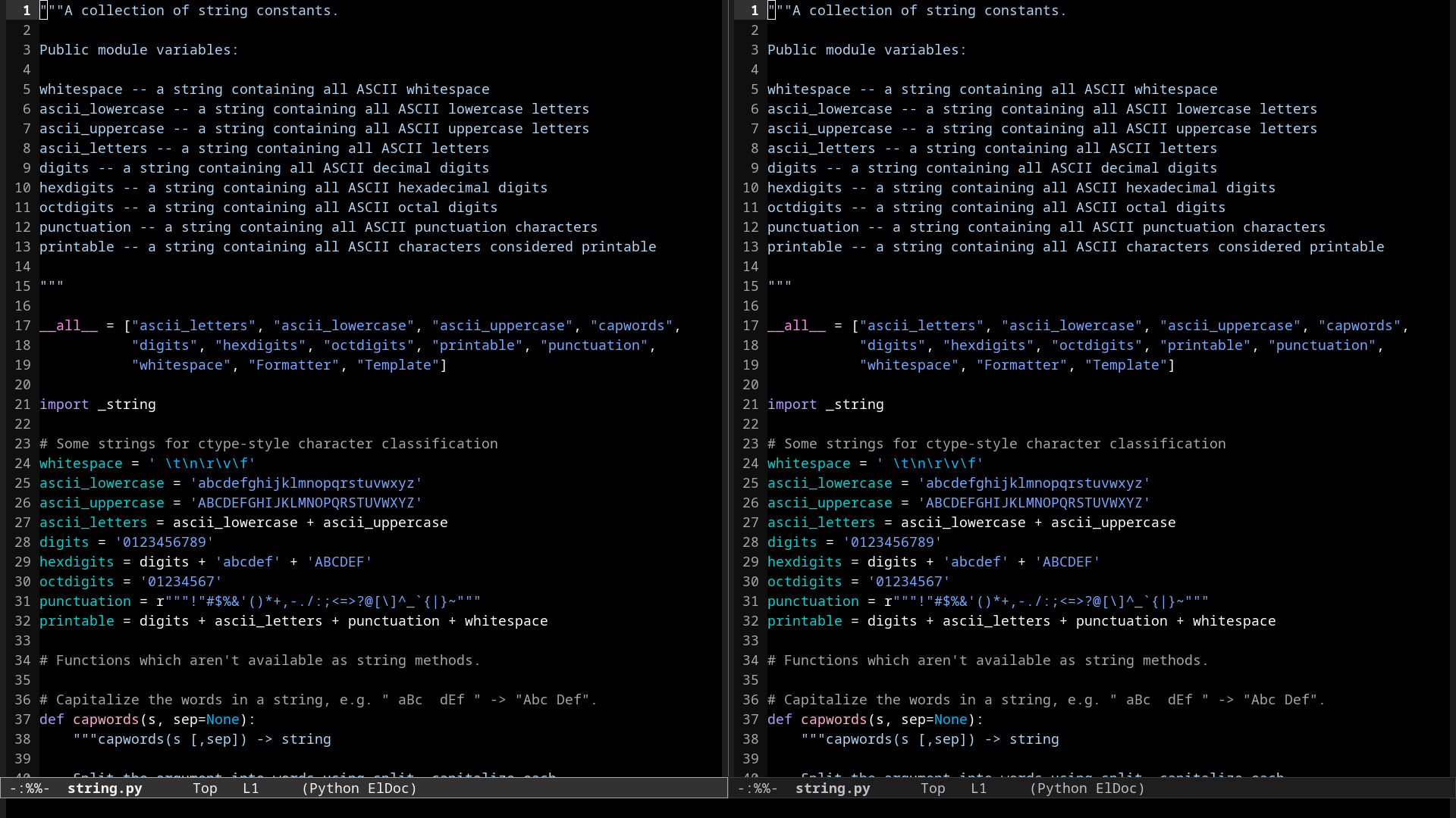
The screenshots below were captured on a 1920×1080 screen. The first screenshot shows Emacs using “5×7.bdf”, a bitmap font. The second screenshot shows Emacs using “NotoSansMono-Regular.ttf”, a vector font. Note that 152 lines and 39 lines fit on the window when using the bitmap font and the vector font, respectively. To me, such difference is significant.
emacs \
  --quick \
  --eval "(load-theme 'modus-vivendi)" \
  --eval "(global-display-line-numbers-mode 1)" \
  --eval "(scroll-bar-mode -1)" \
  --eval "(menu-bar-mode -1)" \
  --eval "(tool-bar-mode -1)" \
  --eval '(set-frame-font "Fixed 5" nil t)' \
  --eval '(find-file "/usr/lib/python3.10/string.py")' \
  --eval '(split-window-right)' \
  --eval '(find-file "/usr/lib/python3.10/string.py")' \
  --eval '(split-window-right)' \
  --eval '(find-file "/usr/lib/python3.10/string.py")'

emacs \
  --quick \
  --eval "(load-theme 'modus-vivendi)" \
  --eval "(global-display-line-numbers-mode 1)" \
  --eval "(scroll-bar-mode -1)" \
  --eval "(menu-bar-mode -1)" \
  --eval "(tool-bar-mode -1)" \
  --eval '(set-frame-font "Noto Sans Mono 12" nil t)' \
  --eval '(find-file "/usr/lib/python3.10/string.py")' \
  --eval '(split-window-right)' \
  --eval '(find-file "/usr/lib/python3.10/string.py")'

Cons
Working with lookalike characters
Using a bitmap font with an incredibly small size can be problematic when working with characters that contain lookalike characters, because such characters can’t be easily spotted.
There are some cases where I generally don’t worry about mistakenly typing a lookalike character:
- When I’m writing or programming in English, because in most cases English uses ASCII characters.
- When I am inspecting the source code of a project in order to understand how its internals works, I hardly ever edit those files, instead I focus on reading. The codebase of most of the open-source projects that I use are written in English, so they mostly use ASCII characters.
Support for bitmap fonts in different programs
If you regularly use bitmap fonts, you might like the benefit of more screen space and you might want to use it in as much software as possible. Unfortunately, there are some software that don’t support using bitmap fonts. For example: kitty (link to issue).
Fortunately, Emacs still suports using bitmap fonts.
Conclusion
I prefer using bitmap fonts when I’m programming on a laptop. When I have to work with lookalike characters, for example when writing text in Spanish where I might type the characters áéíóú, I prefer using a vector font in order to conveniently differentiate áéíóú from aeiou. To me, using bitmap fonts is like standing on a scenic viewpoint and viewing the scenery: you might not be able to spot small details, but you get the general picture.
I prefer using vector fonts when I’m programming on a widescreen monitor or multiple monitors because the screen space is not a problem.
I would add *.otb extension – bitmap font packed in the Open Font container for modern systems which tend to drop support for traditional bitmap fonts.
Blury vector fonts is an issue even in “normal” sizes (say 12px) and the only solution seems to be using HiDPI displays (4k resolution on standard 14″ laptop screen with 2x scaling would provide same real estate like FullHD, but with nice and crisp vector fonts).